How to Create an Airtable Dashboard
Step by step guide to creating an Airtable dashboard, plus how to extend it with a true no code dashboard builder.
Airtable has built in dashboard tools, but they work differently from what most people expect. The platform is structured around views and extensions rather than a traditional drag and drop dashboard canvas, which means building a useful dashboard in Airtable takes a specific approach. This guide covers how to use what Airtable offers natively, where it falls short, and how to build a more flexible dashboard connected to Airtable data using a no code tool.
What Airtable Offers for Dashboards
Airtable has two main ways to visualize data: Views and the Dashboard extension (available on paid plans through the Extensions panel).
Views are different ways to display records in a base. They include Grid (table), Gallery, Kanban, Calendar, Gantt, and the Summary view. These are useful for working with data, but they are not dashboards in the traditional sense since they display raw records rather than aggregated summaries or charts.
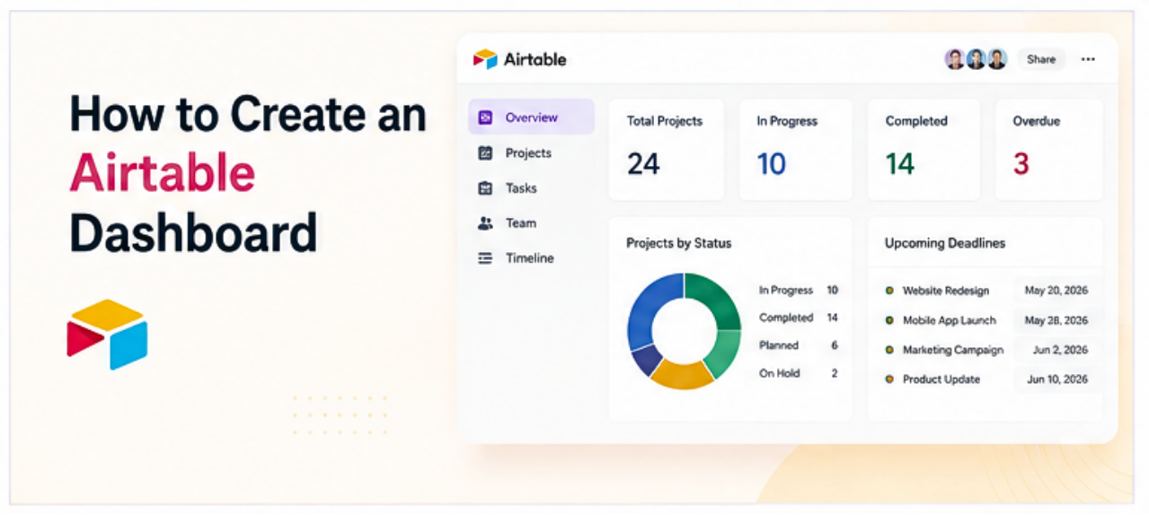
Extensions (previously called Blocks) include chart types, summary tables, and other visualizations that can be added to a Dashboard tab within a base. This is the closest Airtable gets to a traditional KPI or summary dashboard.
Extensions are only available on Pro and Business plans, which is worth knowing before investing time in this approach.
How to Create a Dashboard in Airtable Using Extensions
- Open a base. Navigate to the Airtable base that contains the data to visualize.
- Open the Extensions panel. Click the Extensions button in the top right toolbar (it looks like a grid of squares or a plus icon, depending on the plan and interface version). This opens the Extensions panel on the right side of the screen.
- Add a Chart extension. Click "Add an extension" and browse the library. The most commonly used extensions for dashboards are Chart, Summary, and Page Designer. Click Chart and then Add to Base.
- Configure the chart. Select the table and field to visualize. For a bar chart showing record counts by category, select the table, set the X axis to the category field, and set the Y axis to count of records. Add a title and adjust colors as needed.
- Create a Dashboard tab. In the Extensions panel, there is an option to create a Dashboard, which is a dedicated full screen view of all the extensions added to a base. Click "Create a Dashboard" or navigate to the Dashboards tab if it is already visible. Arrange the extensions into the layout that makes sense.
- Share the dashboard (optional). Airtable allows sharing a read only link to a base view or dashboard. Click Share in the top right and generate a link. Note that anyone with the link can view the data visible in that shared view, so check what is included before sharing externally.
Airtable Dashboard Limitations Worth Knowing
Airtable's native dashboard tools work reasonably well for internal teams already working inside the platform, but a few constraints come up regularly.
Extensions require a paid plan. The free Airtable plan does not include most chart extensions. Access to a meaningful dashboard experience generally requires a Pro plan or higher.
The canvas layout is limited. Airtable's dashboard extension layout does not offer the same level of arrangement flexibility as a dedicated dashboard builder. Extensions stack in a relatively fixed layout rather than a fully free form drag and drop canvas.
Sharing requires Airtable access. Sharing a dashboard publicly or with someone outside the organization gives the recipient access to an Airtable shared view, which may expose more data than intended depending on the configuration. There is no way to publish a clean, branded dashboard to a public URL without using an external tool.
Charts are basic. The chart types available in Airtable extensions cover the most common needs (bar, line, pie, scatter) but offer limited customization compared to a dedicated visualization tool.
How to Build a More Flexible Dashboard Connected to Airtable
A no code dashboard builder that connects directly to Airtable data gives more control over layout, chart types, sharing, and what data is visible to whom, without moving the data out of Airtable.
The general process:
- Connect the no code builder to the Airtable base via the platform's data connection settings.
- Select the tables and fields to display.
- Add dashboard widgets (charts, KPI cards, data tables) using drag and drop.
- Arrange the layout freely on the canvas.
- Publish to a shareable link that anyone can view without needing an Airtable account.
The Airtable base remains the source of truth. Changes made in Airtable appear in the dashboard without any manual update. The dashboard is just a view on top of the data.
This approach is particularly useful when the dashboard needs to be shared with stakeholders, clients, or team members who don't use Airtable directly, or when a more polished layout is needed than what Airtable's extensions provide.
For a broader overview of this approach, see How to Turn a Spreadsheet Into an App Without Code and How to Build a Dashboard Without Code.
Frequently Asked Questions
Related Topics
Build Your Internal Tools With Huddle
Huddle is a zero code application builder that connects to Google Sheets, Airtable, Excel 365, HubSpot, and Salesforce without requiring data migration. Build dashboards, forms, and portals with drag and drop widgets and publish to a shareable link in minutes.
Start building with Huddle